Visualizing grouped data
- We often want to visualize multiple variables, or a
variable that can be divided into groups, in one graphic.
- There are two broad principles for visualizing
grouped variables in R:
- Identify a grouping variable in a
geom() using the group = argument, and
demarcate the distinct objects created per group in some way.
- Use facets to generate geometric objects in
separate coordinate systems for each group.
Colors and fill
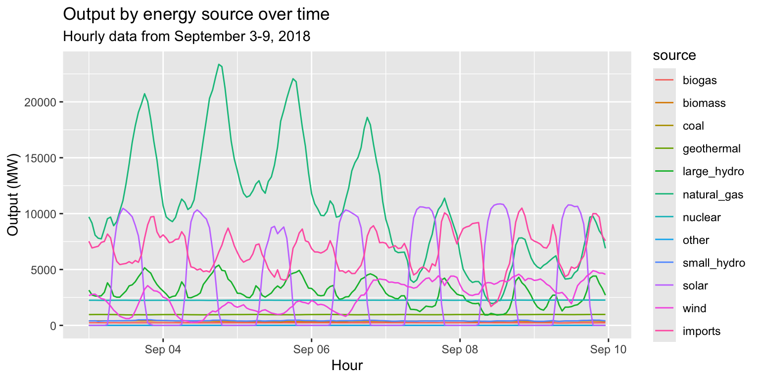
Task:
Create a line plot of energy output over time, with separate
lines for each source.
Steps:
- Supply the data frame
long_merged_energy to ggplot().
- Add a
geom_line() layer and specify
x=datetime and y=output.
- Also specify that
group=source and
col=source.
- Add a
labs() layer.
Colors and fill
long_merged_energy %>%
  ggplot() +
  geom_line(aes(x=datetime, y=output, group=source, col=source)) +
  labs(title="Output by energy source over time", subtitle="Hourly data from September 3-9, 2018", x="Hour", y="Output (MW)")
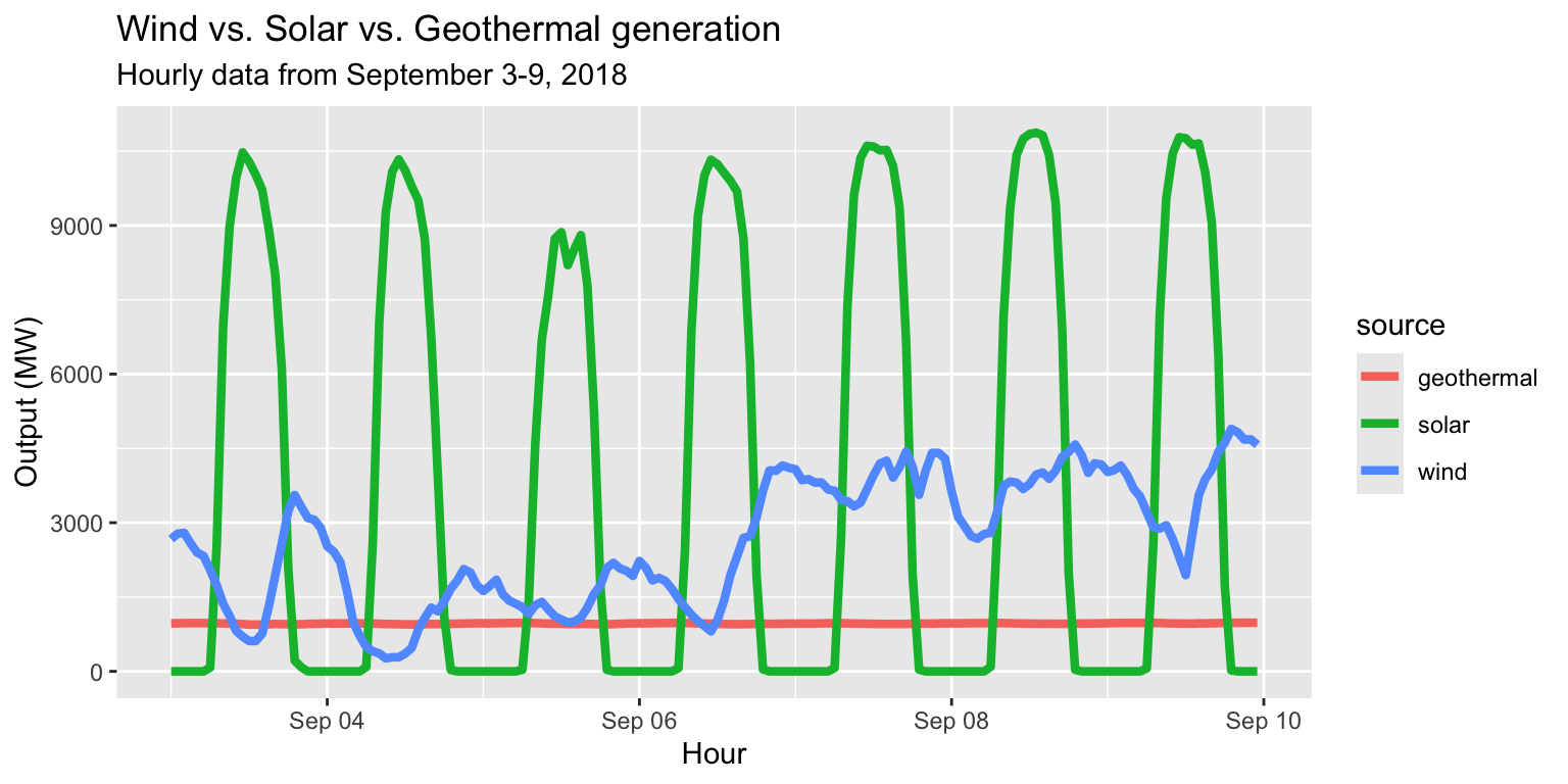
Exercise 4: Colors and fill
Task:
Create a line plot that compares generation of wind, solar,
and geothermal energy over time.
Bonus: Set the line size to 1.5.
Exercise 4: Colors and fill
long_merged_energy %>%
  filter(source=="wind"|source=="solar"|source=="geothermal") %>%
  ggplot() +
  geom_line(aes(x=datetime, y=output, group=source, col=source), size=1.5) +
  labs(title="Wind vs. Solar vs. Geothermal generation", subtitle="Hourly data from September 3-9, 2018", x="Hour", y="Output (MW)")
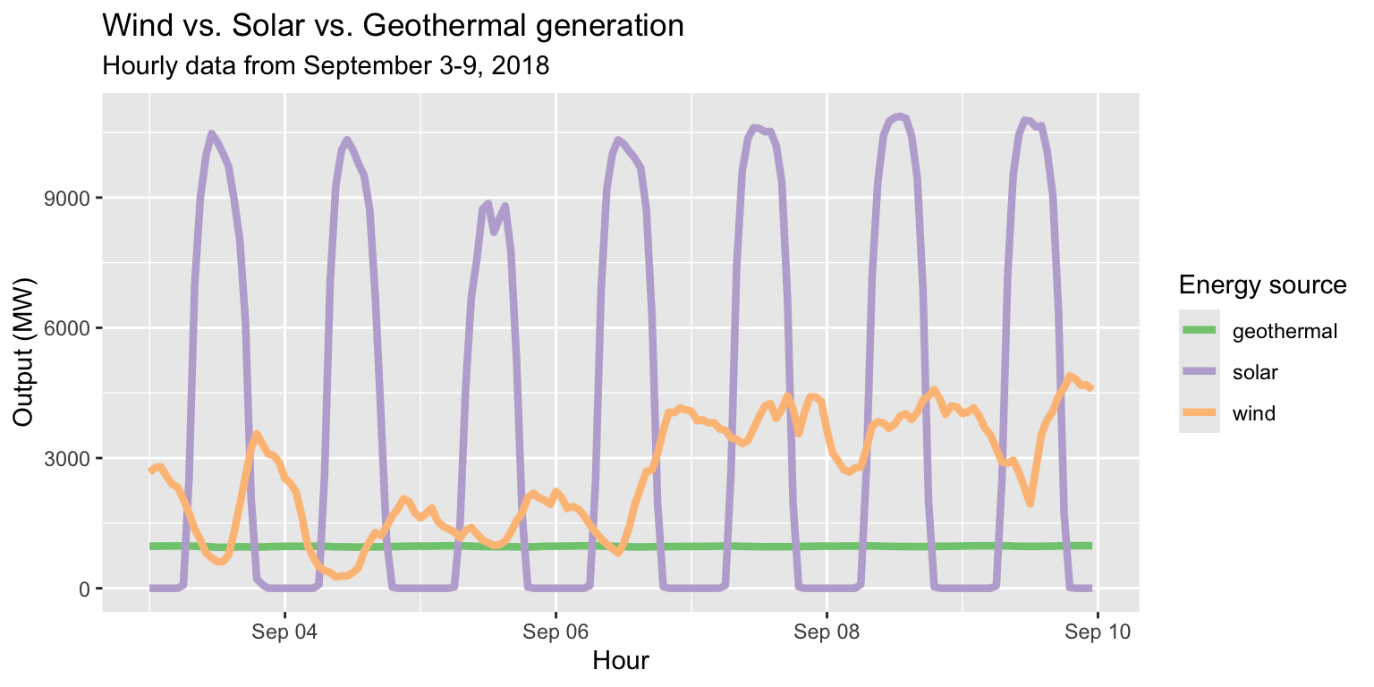
Customizing with scale_color layers
long_merged_energy %>% filter(source=="wind"|source=="solar"|source=="geothermal") %>%
  ggplot() +
  geom_line(aes(x=datetime, y=output, group=source, col=source), size=1.5) +
  scale_color_brewer(palette="Accent", name="Energy source") +
  labs(title="Wind vs. Solar vs. Geothermal generation", subtitle="Hourly data from September 3-9, 2018", x="Hour", y="Output (MW)")
Colors and fill
col= is used to color objects like lines and
pointsfill= is used to color objects like columns and
histograms
col= will create colored outlines for such objects
- After some trial and error, this will become intuitive
Position adjustment
- Once we introduce a grouping variable to a
geom function, we generate multiple geometric objects on
the same plot.
- Colors and fill help us distinguish each object
from other objects.
- Another way to distinguish objects, often used
together with color/fill, is position adjustment.
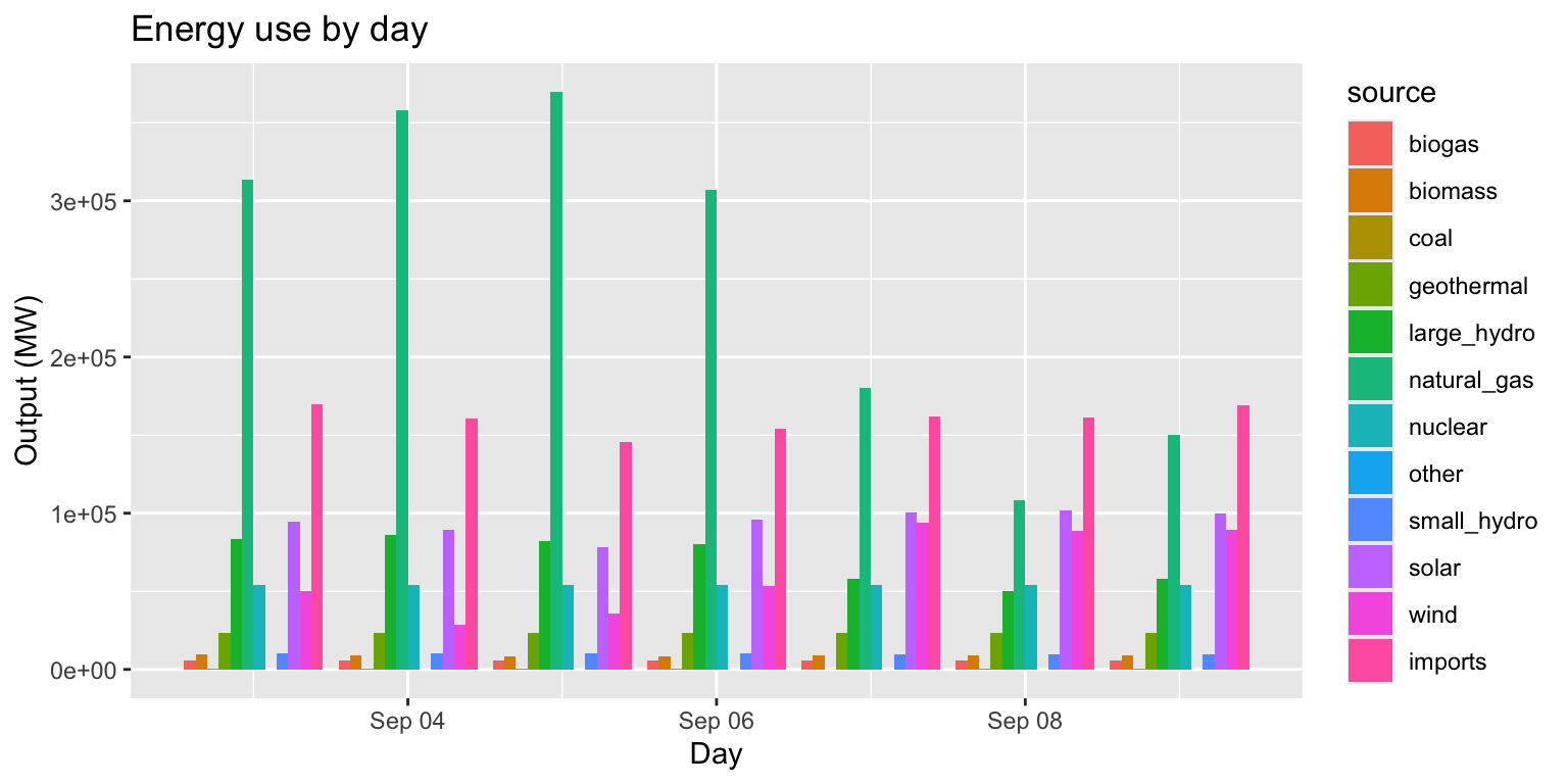
Example: Energy use by day
Task:
Create a column chart of energy use by day, grouped by
source.
Steps:
- Modify
long_merged_energy to summarize
output by date and source.
- Use
mutate() to create a
date variable from datetime.
- Use
group_by() and
summarize() to calculate total output per date per
source.
- Supply modified data frame to
ggplot()
- Add a
geom_col() layer, supply
x and y aesthetics.
- Specify
group=source and
fill=source.
- Add a
labs() layer.
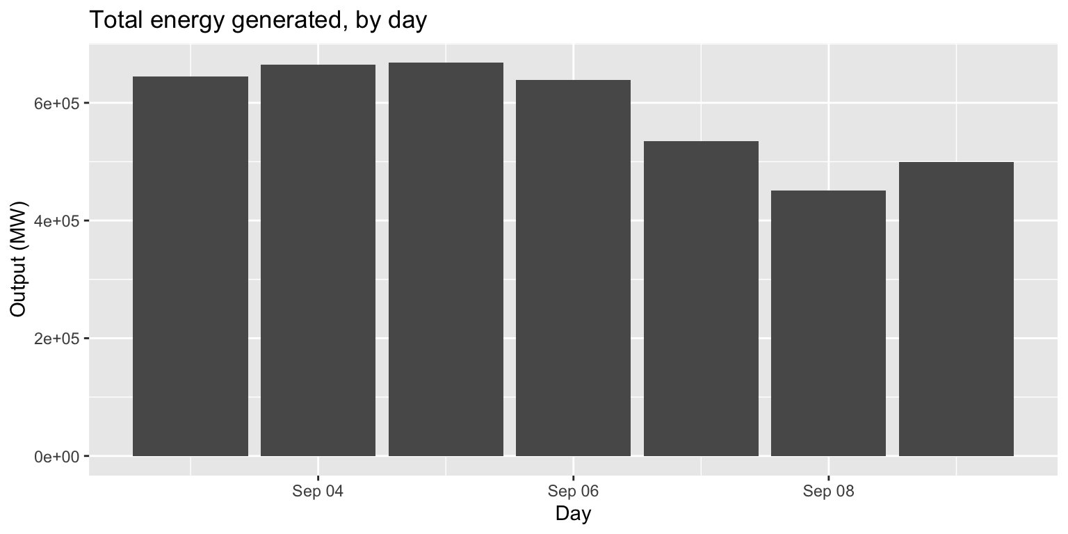
Example: Energy use by day
long_merged_energy %>%
  mutate(date=lubridate::date(datetime)) %>%
  group_by(date, source) %>%
  summarize(output=sum(output)) %>%
  ggplot() +
  geom_col(aes(x=date, y=output, group=source, fill=source)) +
  labs(title="Energy use by day", x="Day", y="Output (MW)")
## `summarise()` has grouped output by 'date'. You can override using the
## `.groups` argument.

Example: Energy use by day
- This column chart is useful if our main goal is to
examine total output over time across sources.
- But what if our main goal is to compare trends
across sources?
- We can use
position="dodge" in
geom_col() ‘unstack’ the columns for each source.
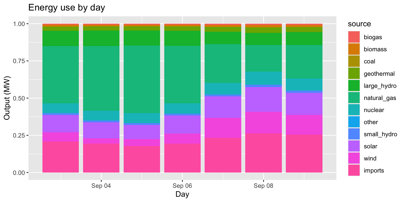
- What if our goal is to compare what portion of
output per day each source comprises?
- We can use
position="fill" to
normalize height of stacked columns.
Example: Energy use by day (pos dodge)
long_merged_energy %>%
  mutate(date=lubridate::date(datetime)) %>%
  group_by(date, source) %>%
  summarize(output=sum(output)) %>%
  ggplot() +
  geom_col(aes(x=date, y=output, group=source, fill=source), position="dodge") +
  labs(title="Energy use by day", x="Day", y="Output (MW)")
## `summarise()` has grouped output by 'date'. You can override using the
## `.groups` argument.
Example: Energy use by day (pos fill)
long_merged_energy %>%
  mutate(date=lubridate::date(datetime)) %>%
  group_by(date, source) %>%
  summarize(output=sum(output)) %>%
  ggplot() +
  geom_col(aes(x=date, y=output, group=source, fill=source), position="fill") +
  labs(title="Energy use by day", x="Day", y="Output (MW)")
## `summarise()` has grouped output by 'date'. You can override using the
## `.groups` argument.
Shapes and linetypes
- Colors/fill and position adjustment are the most
common and intuitive way to distinguish geometric objects from each
other.
- Shapes and linetypes are two other ways.
- The idea here is to modify what the object actually
looks like.
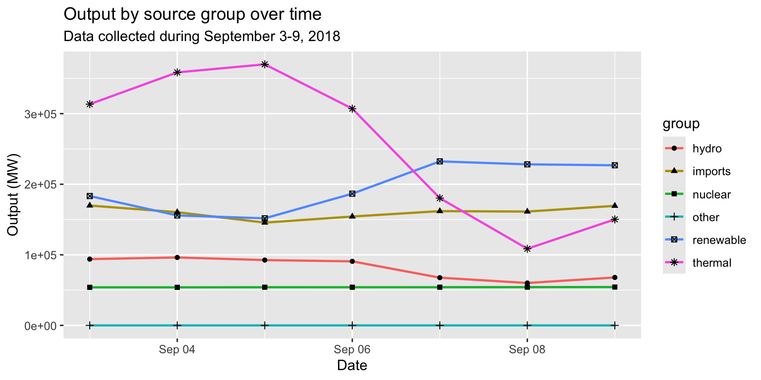
Example: Energy source group, by day
Task:
Create a line graph of the output by day, with a different
line for each regrouped group (renewable, hydro, etc.)
Steps:
- Prepare data frame that summarizes output by date
and “group” from
regroup.
- Supply modified data frame to
ggplot().
- Two choices!
- Add
geom_line() and
geom_point() with shape=group.
- Add
geom_line() with
linetype=group.
Example: Energy source group by day
# Prepare data
long_merged_energy_regroup <- long_merged_energy %>%
  rename(type = source) %>%
  merge(regroup, by = "type") %>%
  mutate(date=lubridate::date(datetime)) %>%
  group_by(date, group) %>%
  summarise(output=sum(output))
## `summarise()` has grouped output by 'date'. You can override using the
## `.groups` argument.
# Take a look at our prepared data
head(long_merged_energy_regroup)
## # A tibble: 6 × 3
## # Groups:   date [1]
##   date       group      output
##   <date>     <chr>       <dbl>
## 1 2019-09-03 hydro      93919.
## 2 2019-09-03 imports   169826.
## 3 2019-09-03 nuclear    53926.
## 4 2019-09-03 other          0
## 5 2019-09-03 renewable 183304.
## 6 2019-09-03 thermal   313436.
Example: Energy source group, by day
long_merged_energy_regroup %>%
  ggplot() +
  geom_line(aes(x=date, y=output, group=group, col=group), size=0.8) +
  geom_point(aes(x=date, y=output, group=group, shape=group)) +
  labs(title="Output by source group over time", subtitle="Data collected during September 3-9, 2018", x="Date", y="Output (MW)")
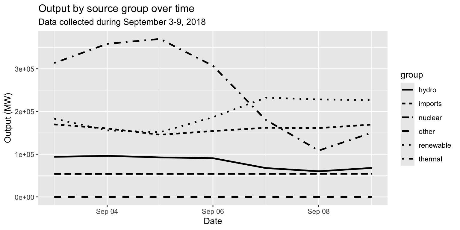
Example: Energy source group, by day
long_merged_energy_regroup %>%
  ggplot() +
  geom_line(aes(x=date, y=output, group=group, linetype=group), size=1) +
  labs(title="Output by source group over time", subtitle="Data collected during September 3-9, 2018", x="Date", y="Output (MW)")
Sizes and alpha
size= and alpha= inside
aes() modulate the size and transparency of geom objects
based on some data value.- They are particularly useful when you want to
distinguish objects based on some continuous variable.
- Let’s return to the Gapminder data for an
example.
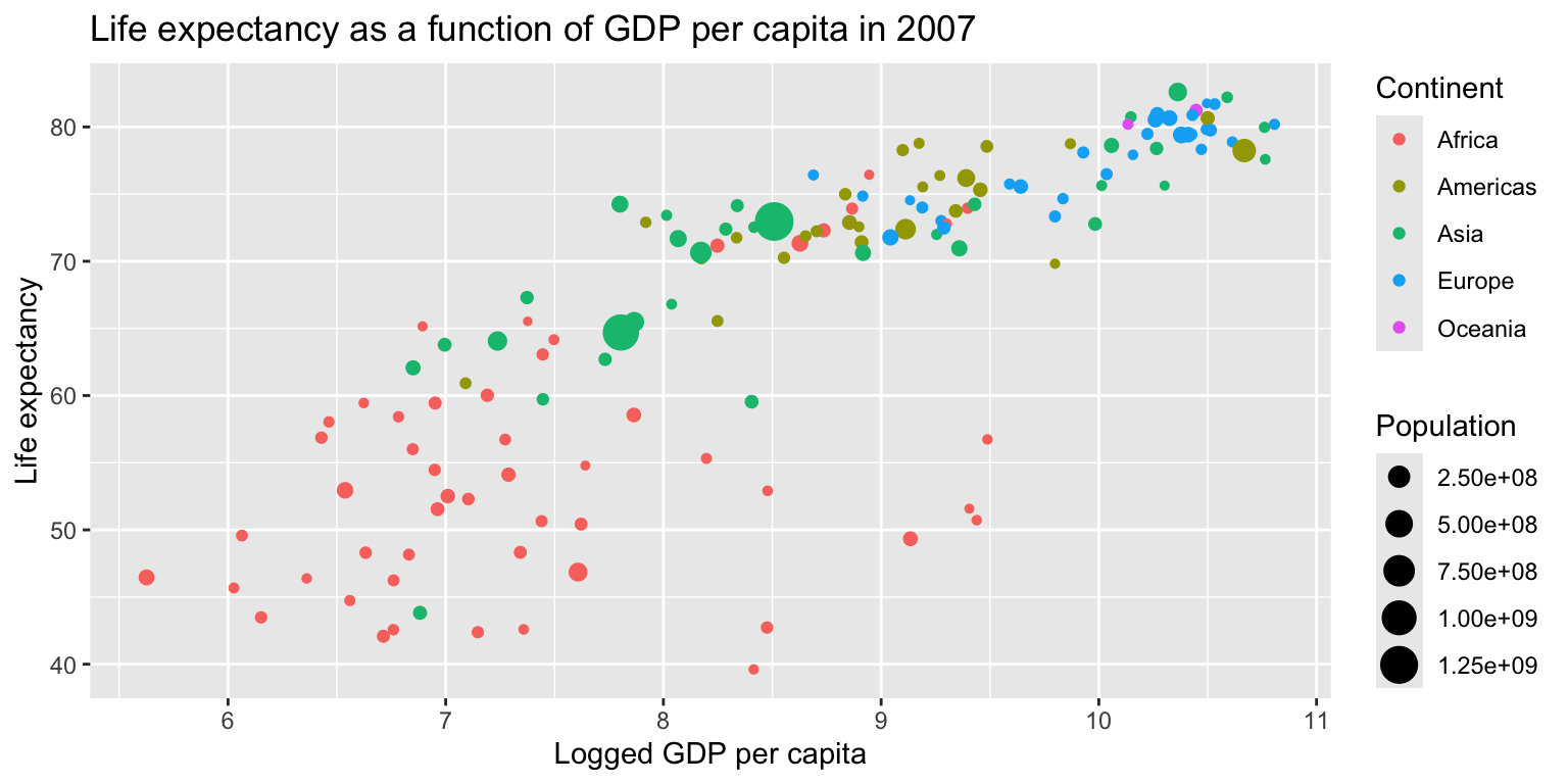
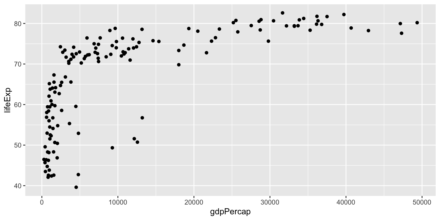
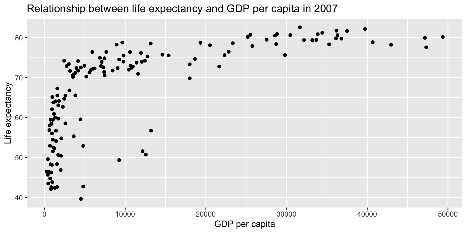
Example: Life expectancy over GDP
gapminder07 %>%
  ggplot() +
  geom_point(aes(x=log(gdpPercap), y=lifeExp, size=pop, col=continent)) +
  scale_size_continuous(name="Population") + scale_color_discrete(name="Continent") +
  labs(title="Life expectancy as a function of GDP per capita in 2007", x="Logged GDP per capita", y="Life expectancy")
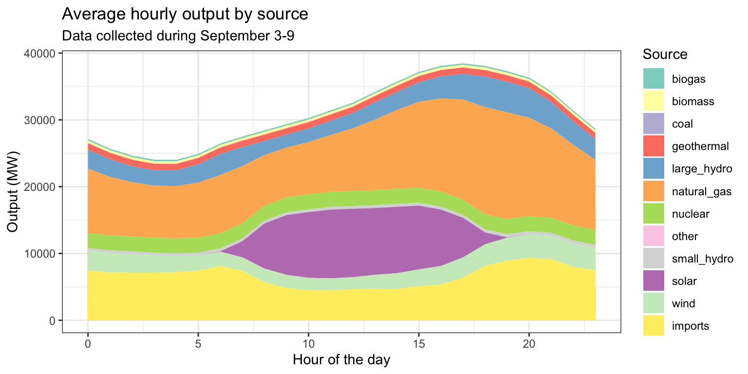
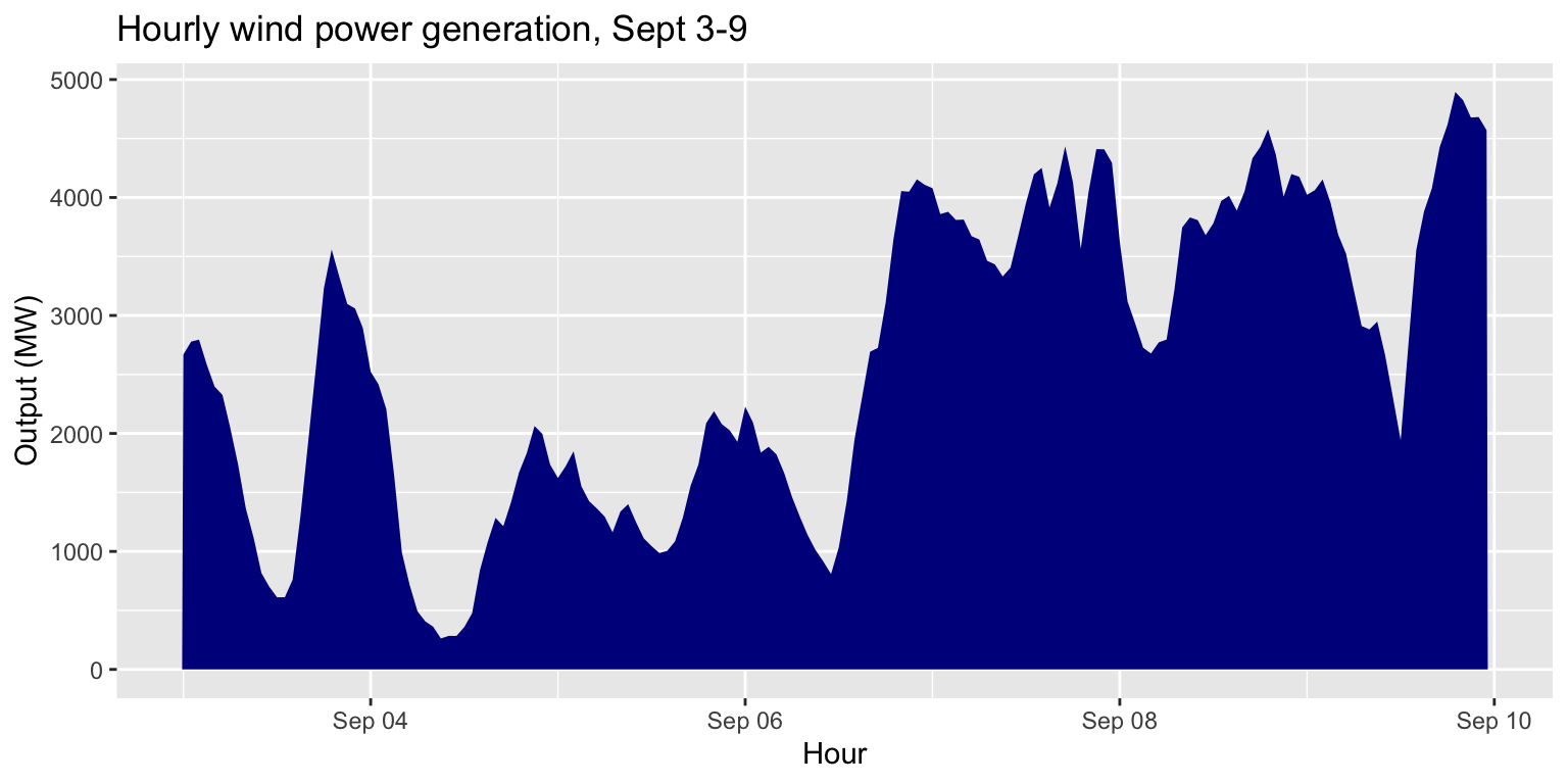
Exercise 5: Average hourly output by source
Task:
Visualize the average output for each hour of the day,
grouped by source.
You need to identify the output per source per hour
(e.g. 01:00, 02:00, etc) averaged over all days.
- You will need to prepare your data using both
dplyr and
lubridate functions.
- You can choose which
geom(s) to use, and how to
demarcate groups.
- Bonus: use a scale layer to set a color palette (try
"Set3") and change the legend name.
- Remember to add
labs()!
Exercise 5: Average hourly output by source
ex5 <- long_merged_energy %>%
  mutate(hour=lubridate::hour(datetime)) %>%
  group_by(hour, source) %>%
  summarize(output=mean(output)) %>%
  ggplot() +
  geom_area(aes(x=hour, y=output, fill=factor(source))) +
  scale_fill_brewer(palette="Set3", name="Source") +
  labs(title="Average hourly output by source",
       subtitle="Data collected during September 3-9",
       x="Hour of the day", y="Output (MW)") +
  theme_bw()
## `summarise()` has grouped output by 'hour'. You can override using the
## `.groups` argument.
Exercise 5: Average hourly output by source
Facets
- So far we have been visualizing grouped data by
changing the appearance or position of the objects.
- A different approach is to use facets, which
creates separate coordinate systems for each geometric object.
Example: Comparing generation patterns
Task:
Compare energy generation over time, across sources.
How do we do this? Using what we’ve learned so far:
- Supply
long_gen to
ggplot().
- Add a
geom_line() layer, setting
x=datetime and y=output in
aes().
- Let’s set
group=source and
col=source in aes().
Example: Comparing generation patterns
long_gen %>%
  ggplot() +
  geom_line(aes(x=datetime, y=output, group=source, col=source), size=1) +
  labs(title="Generation over time, by energy source", subtitle="Hourly data from September 3-9, 2018", x="Hour", y="Output (MW)")
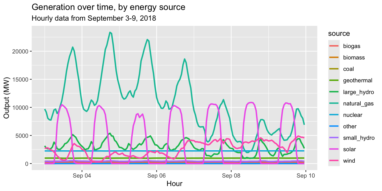
Example: Comparing generation patterns
Is this a helpful plot?
- Not if our goal is to compare the patterns of each
source.
- It’s too noisy!
- Instead of setting
col= in
aes(), let’s add a facet_wrap() layer.
- Specifically,
facet_wrap(~source),
i.e. tell ggplot to “facet by source”.
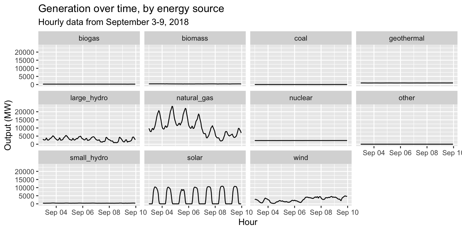
Example: Comparing generation patterns
long_gen %>%
  ggplot() +
  geom_line(aes(x = datetime, y = output)) +
  facet_wrap(~source) +
  labs(title="Generation over time, by energy source", subtitle="Hourly data from September 3-9, 2018", x="Hour", y="Output (MW)")
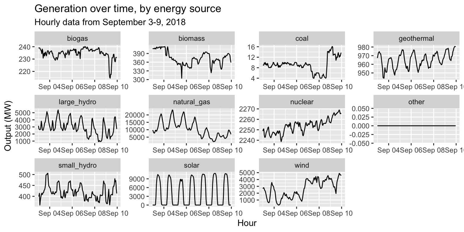
Example: Comparing generation patterns
long_gen %>%
  ggplot() +
  geom_line(aes(x = datetime, y = output)) +
  facet_wrap(~source, scales="free") +
  labs(title="Generation over time, by energy source", subtitle="Hourly data from September 3-9, 2018", x="Hour", y="Output (MW)")
Exercise 6: Facets
Task:
Alter the facet plot by:
- Making the line in each plot a different color
- Making the lines thicker
- Moving the legend to the bottom
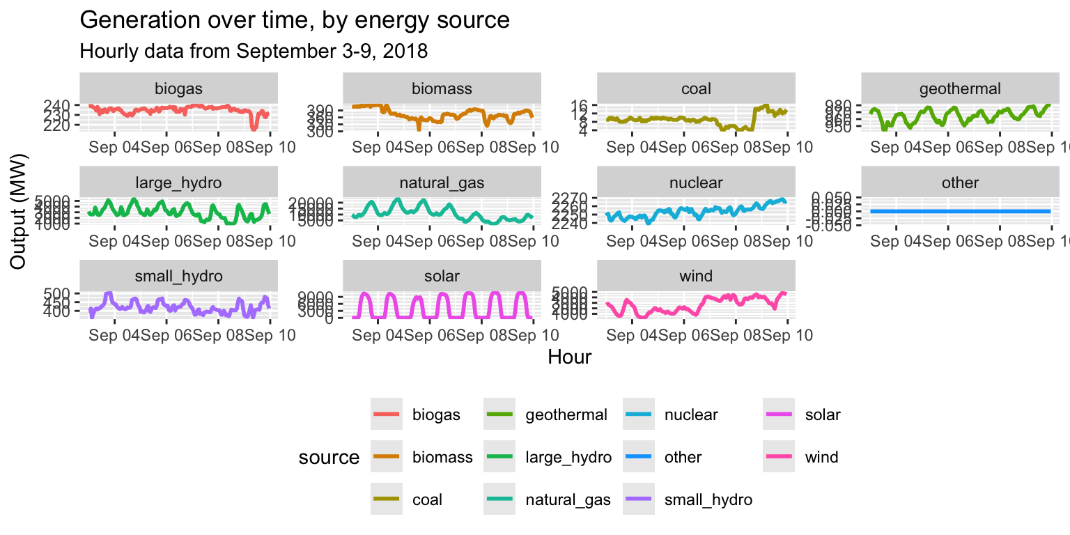
Exercise 6: Facets
long_gen %>%
  ggplot() +
  geom_line(aes(x = datetime, y = output, col=source), size=1) +
  facet_wrap(~source, scales="free") +
  labs(title="Generation over time, by energy source", subtitle="Hourly data from September 3-9, 2018", x="Hour", y="Output (MW)") +
  theme(legend.position = "bottom")
Final Exercise
The instructions are in a markdown file in the exercises
folder. Create a new RMarkdown file (save it using this naming
convention: FinalRExercise_LastnameFirstname.Rmd), in which
you will complete the exercise.
You can work in small groups, but write up your code separately.
Raise your hand if you need help!
Optional Submissions
You’ve created several RMarkdown files over the past three days.
Since you stored these in a forked repo, it is possible to create a pull
request and ‘submit’ these changes to the base repo. This is
optional, but gives you a chance to explore Github
functionality and share your work with your classmates.
Before you submit your completed exercises, move every new file
in your repo to the submissions folder. This
ensures that we won’t inadvertently make changes to the session
materials. Then, create a new pull request, asking to merge changes from
your fork to the base repository.

Comment your code
Always remember to comment your code!
When writing particularly complex code in
dplyrorggplot2, this includes commenting within a flow of%>%or+operators. See the lecture notes for some examples of this.